
Brand Identity, Print, and Digital Design
Client: St. Petersburg School of Conference Interpreting and Translation, Herzen University
Context: IV UN–MoU Universities Conference, St. Petersburg, April 2015
Scope: Visual identity, logo system, conference website, bilingual programme booklet, article collection brochure, delegate badges
Role: Sole designer — concept through final production
The Brief
Herzen University was selected to host the fourth annual gathering of the UN MoU University Network — a programme connecting universities worldwide with the UN Department for General Assembly and Conference Management to train language professionals. The conference theme, Training Language Professionals for International Organizations, was expressed as four imperatives: Learn. Teach. Coach. Mentor.
The identity needed to work across a bilingual (English/Russian) international event with attendees from UN offices in New York, Geneva, Vienna, Nairobi, and Beirut, as well as universities from over a dozen countries. It had to coexist credibly alongside established institutional marks — the UN emblem, Herzen University’s seal, and the SCIT logo — without competing with them or looking like a generic academic conference.
The Design Challenge
Conference identities typically default to the host institution’s existing brand, resulting in materials that feel like internal university communications rather than international events. The task here was to create a distinct event identity with its own visual logic — one that felt appropriate to a UN-affiliated context while remaining flexible enough for a range of outputs: web, print, signage, and personalised delegate materials.
A secondary constraint: the four-word theme needed to function as both a tagline and a structural brand element across all touchpoints.
Design Constraints
The official conference title presented an immediate typographic challenge. In English it was manageable: IV UN–MoU Universities Conference / Training Language Professionals for International Organizations. But in Russian it ran to eighteen words before the subtitle:
IV Конференция университетов, подписавших Меморандумы с ООН о взаимопонимании в вопросах подготовки переводчиков для сдачи квалификационных экзаменов / Обучение переводчиков для международных организаций
Academic and institutional requirements meant the full bilingual title had to appear on official materials — the programme cover, the brochure, the website header. This created a practical problem: the title consumed significant space in every layout and resisted hierarchy. Something shorter needed to do the identity work.
The four-word slogan, Learn. Teach. Coach. Mentor., was the functional answer. It wasn’t a substitute for the official title but a parallel register: the title satisfied institutional obligations, the slogan anchored the visual identity. This is why the slogan carries so much structural weight across the materials, appearing in the circular logo lockup, as the hero text on the website, and as the dominant typographic element on the badge. The design system was built around the slogan precisely because the title couldn’t serve that role.
Concept Exploration
Three distinct directions were developed and presented for client review.
Direction 1. Interlocking Ribbons
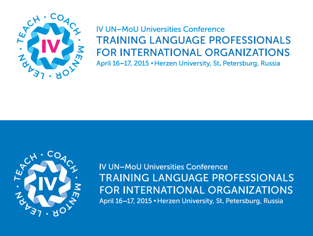
A circular badge mark built from four interlocking ribbon forms in blue and magenta, with the Roman numeral IV at the centre and the four theme words embedded in the surrounding ring. Energetic and internationally legible. Rejected: the ribbon motif of interconnection is generically applicable to any collaborative event — it carries no visual logic specific to language training or human mentorship. Without that conceptual anchor, the mark risks reading as decorative rather than purposeful.
Direction 2. Contour Form
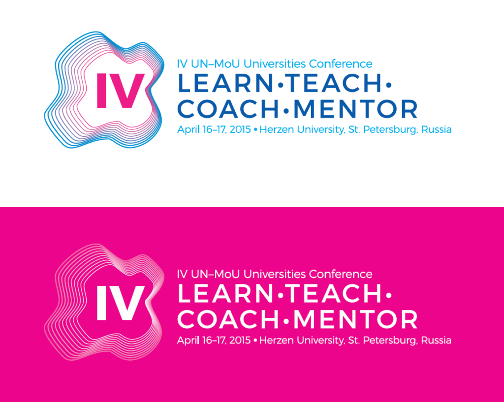
A horizontal lockup pairing a multi-line topographic contour shape (suggesting layers, depth, and accumulated knowledge) with the four theme words set in bold uppercase. Visually distinctive and contemporary. Rejected: like Direction 1, the contour form is evocative but open-ended — it doesn’t encode anything specific to this conference’s subject matter. The same mark could credibly represent a technology event or a geography symposium. The concept doesn’t earn its specificity.
Direction 3. Figure Mark (Selected)
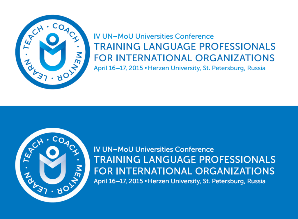
The starting point was the MoU letterforms themselves — looking for a way to make the characters work together visually rather than just typographically. Exploring the open book as an education symbol unlocked the solution — prompted in part by a Soviet-era school uniform badge, combining an open book with a rising sun, which collapsed the same ideas of knowledge and human aspiration into a single heraldic form. An open book seen straight-on reads as a raised-arms figure, and the spine of the book traces the letter M. The three readings — open book, M for MoU, and a handshake between two parties (directly encoding the Memorandum of Understanding concept) — collapsed into a single geometric mark. The polysemy is intentional: each reading reinforces a different dimension of the conference — education, the programme acronym, and the partnership framework the network is built on. Clean enough to work at badge scale, flexible enough to hold across web and print. The circular lockup with the four theme words embedded in the ring reinforced the four-pillar structure without requiring separate typographic explanation.
Identity System
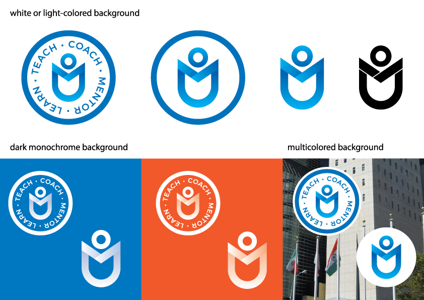
The adopted mark was developed into a complete usage system covering:
- Primary lockup — circular badge with full theme ring
- Symbol — standalone figure mark for space-constrained applications
- Monochrome variants — for single-colour print and embossing
- Colour variants — light backgrounds, dark monochrome backgrounds, photographic backgrounds
- Colour palette — UN institutional blue as the primary anchor, with a warm secondary for contrast applications
Typography across all materials used a clean geometric sans, maintaining a formal register appropriate for an international institutional event while remaining legible across both Cyrillic and Latin scripts.
Deliverables
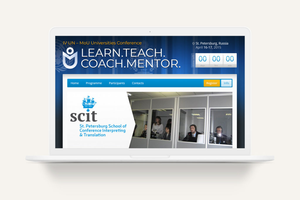
Conference website. Full-site design and development for 2015mouconf.herzen.spb.ru. Selected and customised a WordPress theme to carry the conference identity across all pages, including programme, participant listings, and registration. Handled both visual design and front-end implementation independently.
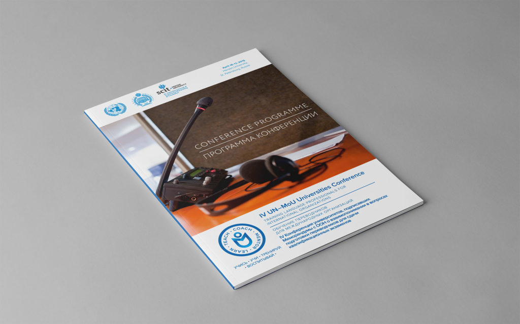
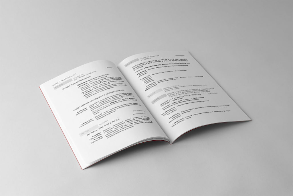
Bilingual conference programme. 15-page booklet in English and Russian, including full two-day schedule with speaker names, session titles, and room assignments across both languages, designed to read naturally in either direction.
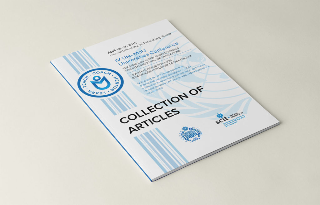
Article collection brochure. Front cover and layout for the printed collection of conference papers, co-branded with UN, Herzen University, and SCIT marks.
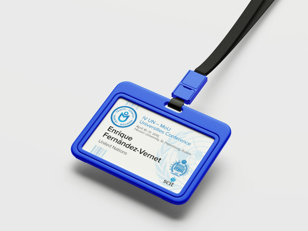
Delegate badges. Personalised badge design applied across all registered participants, incorporating the event identity, co-branding, and variable name/affiliation data.
Outcome
The conference took place as planned in April 2015, with attendees representing UN offices and universities from over a dozen countries.
Following the conference, the identity developed for the Herzen University event was adopted by UN ESCWA as the standard visual mark for the MoU programme. The logo and identity system has since been used across at least two subsequent conferences — the 7th MoU Conference (2021, hosted by UN ESCWA in Beirut) and the 8th MoU Conference — and remains in active use on official UN infrastructure as of 2025.
Verification: The mark is visible on the live conference sites at mou7.unescwa.org and mou8-dgacm.unescwa.org, and on the original conference website at 2015mouconf.herzen.spb.ru.