Client: Big Data Management and Analytics Conference (BDMA)
Scope: Logo design, visual identity system, brand guidelines
Role: Sole designer — strategy, concept, execution, guidelines documentation
Status: Concept delivered; pilot conference did not proceed to production
The Brief
BMA was a planned conference designed to bridge academic research and business investment around Big Data and Analytics — connecting scientists, investors, and technology startups. The organisers positioned it explicitly at the intersection of academia and industry, with the primary goal of creating a credible platform where researchers and investors could meet and establish collaborations.
The design brief was specific about what the identity needed to do: attract attention, clearly communicate the conference concept, express the connection between academia and investors, and feel professional, modern, and trustworthy. Crucially, the client asked for an intelligent concept rather than a decorative symbol — a logo where the graphic mark communicates an underlying idea. Style references pointed toward clean, geometric, Scandinavian-inspired minimalism.
The conference was conceived as a pilot event. If successful, it would grow into an annual series with variations in topic focus — a condition that shaped the design strategy fundamentally.
Concept Exploration
First Round: Structural Directions
Five structurally distinct directions were developed and presented in the first round.
Direction 1 — Negative Space Letterforms
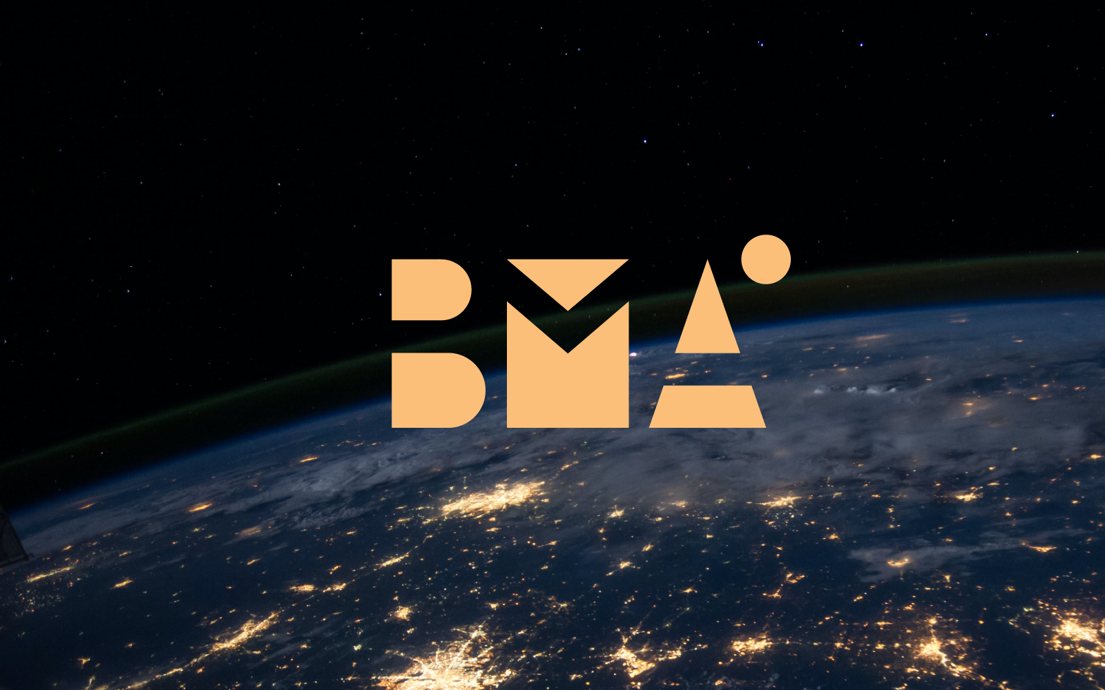
B, M, and A built from geometric positive shapes using negative space — the letters exist as the absence within the forms rather than drawn strokes. Clean, geometric, conceptually non-illustrative. This direction directly answered the client’s request for an intelligent concept over a decorative symbol. Selected for development.

Direction 2 — Hourglass/Intersection Icon
A standalone geometric symbol built from two opposing triangles — an hourglass or bowtie form representing the convergence of two worlds. Explored both as a standalone mark with the wordmark, and as a replacement for the M within the letterstring. The two-triangle form reads as meeting, exchange, or connection. Visually strong but the icon is generic enough to represent any kind of intersection or collaboration — not specific to data, academia, or business.

Direction 3 — Icon Above Wordmark
A conventional structure: descriptive icon positioned above the BMA wordmark. Icons explored included a graduation cap (academia), layered data shapes, and a bar chart substituting for the M. Straightforward and immediately legible, but illustrative rather than conceptual — the opposite of what the client brief specified.

Direction 5 — Graduation Cap/Currency Icon
A pictorial mark combining a graduation cap (academia) with stacked currency (investment) — the two audiences of the conference represented as a single merged object. Literal and memorable, but again illustrative. Explored in colour-coded versions separating the two elements by hue.

Second Round: Developing the Negative Space Direction
With Direction 1 selected, the next phase explored how to extend it beyond a static wordmark toward something appropriate for a recurring series.

The first attempt replaced the M letterform entirely with a figurative icon — a graduation cap incorporating a dollar sign — positioned between the B and A. The combined symbol encoded both conference audiences simultaneously: academia and investment in a single merged mark. Conceptually direct, but it broke the structural logic of the negative space system: the other letters exist as geometric absence, while the M-replacement is a drawn pictorial object. The inconsistency between construction principles made it read as two different design languages in one mark. Rejected on that basis.
The rejection of figurative accents prompted the more useful question: what if the accent element didn’t need to mean a specific thing — what if it changed per edition? The variable accent system emerged from that.
The Emerged Strategy: An Umbrella Identity System
A fixed logo with a fixed colour made sense for a single event. It made no sense for a series where each edition would carry a different thematic emphasis — and the conference was explicitly conceived as a pilot that would grow into an annual series with varying topics.
The variable accent element answered both problems at once: a geometric mark built on a fixed letterform construction, with a secondary element in the upper-right position that shifts per edition to reflect that year’s specific focus. Colour follows the same logic — no fixed palette, each edition selecting from saturated, high-contrast colours appropriate to its subject matter. The letterform geometry and structural logic remain fixed across all editions; only the accent and colour change.
The result is an umbrella identity that reads as a coherent brand family while giving each event its own distinct visual signature. This is not a logo with colour variants — it is a logo system with built-in flexibility. The distinction matters: colour variants are executional, a variable structural element is architectural.

The identity moved from a logo to a brand platform not by adding more meaning to the mark, but by building variability into its structure from the start — and that decision came not from the brief, but from the process of rejecting the obvious alternatives.
The Identity System
The adopted direction was developed into a complete brand system documented in a formal guidelines document covering:
Mark construction — The B, M, and A letterforms are built from geometric positive shapes; the letters themselves exist as negative space within those shapes. The accent element sits at the upper right of the A and is defined per edition.

Colour system — No fixed brand colour. Each edition selects a saturated, high-contrast palette appropriate to its topic. The guidelines specify a preference for bold, vivid colours and explicitly permit gradients and photographic fills applied directly to the mark. Metallic printing and foil stamping are noted as appropriate for print applications given the geometric construction. The negative space construction was specifically designed to work over photographic backgrounds, a practical requirement for a conference identity used across digital channels and event signage. The guidelines document this explicitly, including the condition for sufficient contrast.

Clearance zone — Defined relative to the height of the upper element of the A letterform, maintaining proportional consistency across all size applications.

Logotype lockup — Two configurations documented with precise spacing rules: slogan positioned to the right of the mark, and slogan positioned below the mark. Spacing defined relative to the height of the upper element of the B.

Deliverables
The sole deliverable was a brand guidelines document covering logo construction, colour system, clear space rules, lockup configurations, and illustrated usage examples across social media, outdoor signage, and delegate badges. All application mockups were created to demonstrate the identity system’s range and flexibility; no production materials were developed, as the conference did not proceed.


Outcome
The pilot conference did not proceed to production. The conference website (bdma2019.com) is no longer active. The identity system was completed and delivered to the client; no physical or digital event materials were produced.