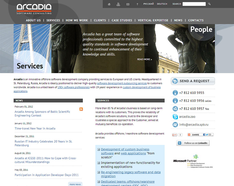
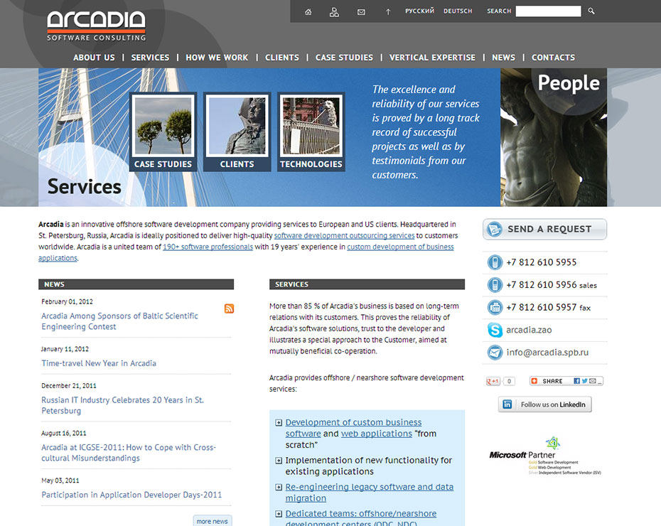
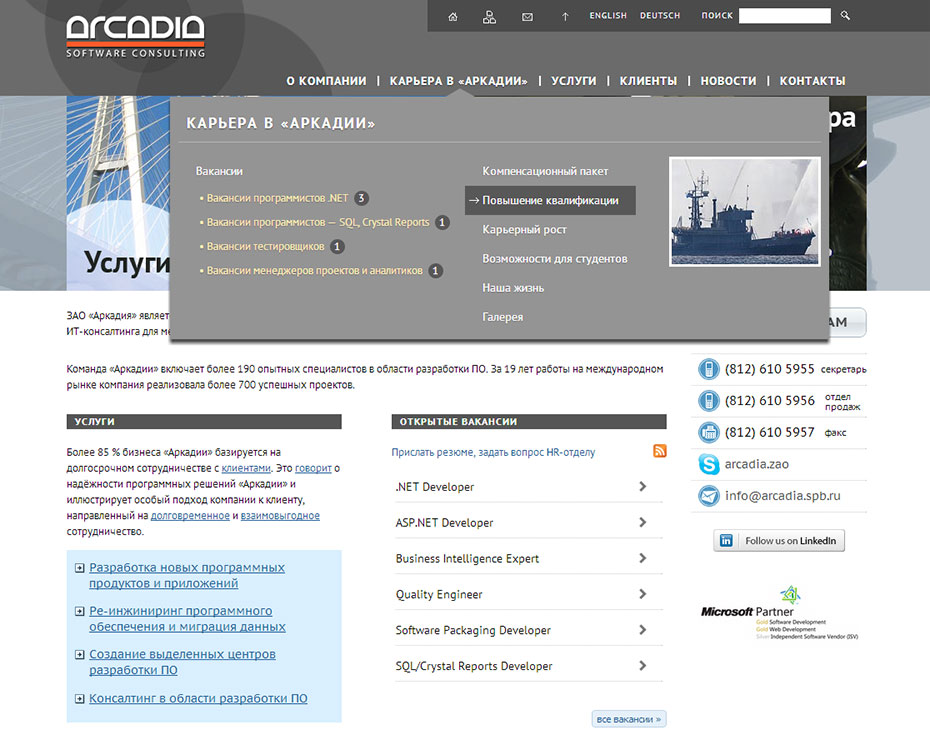
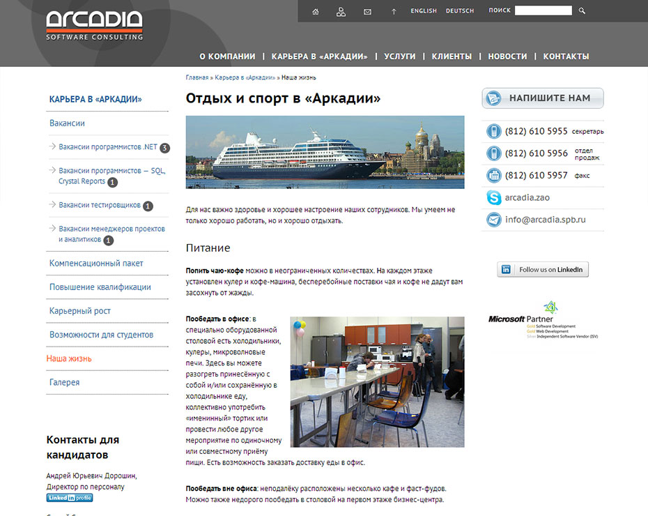
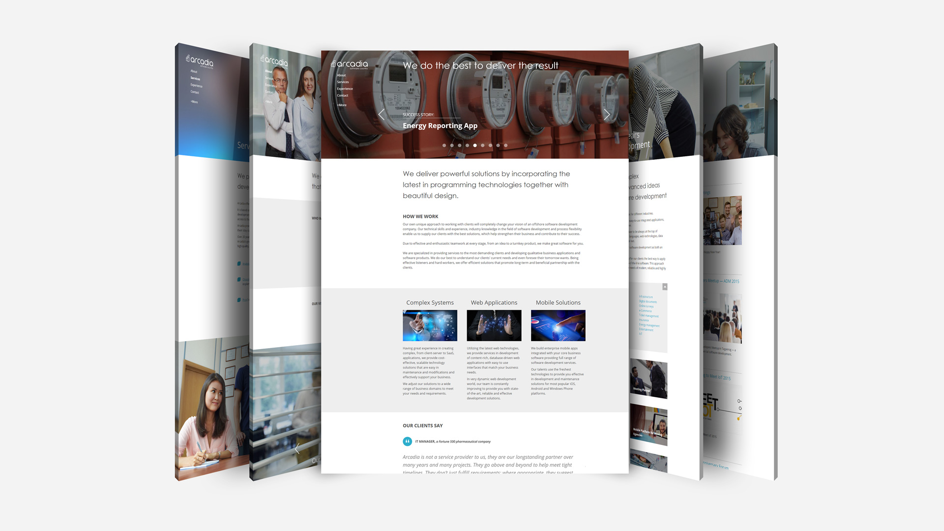
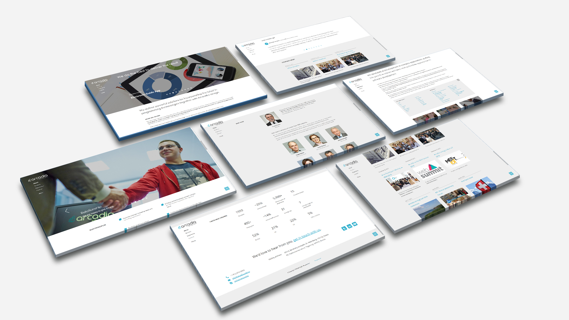
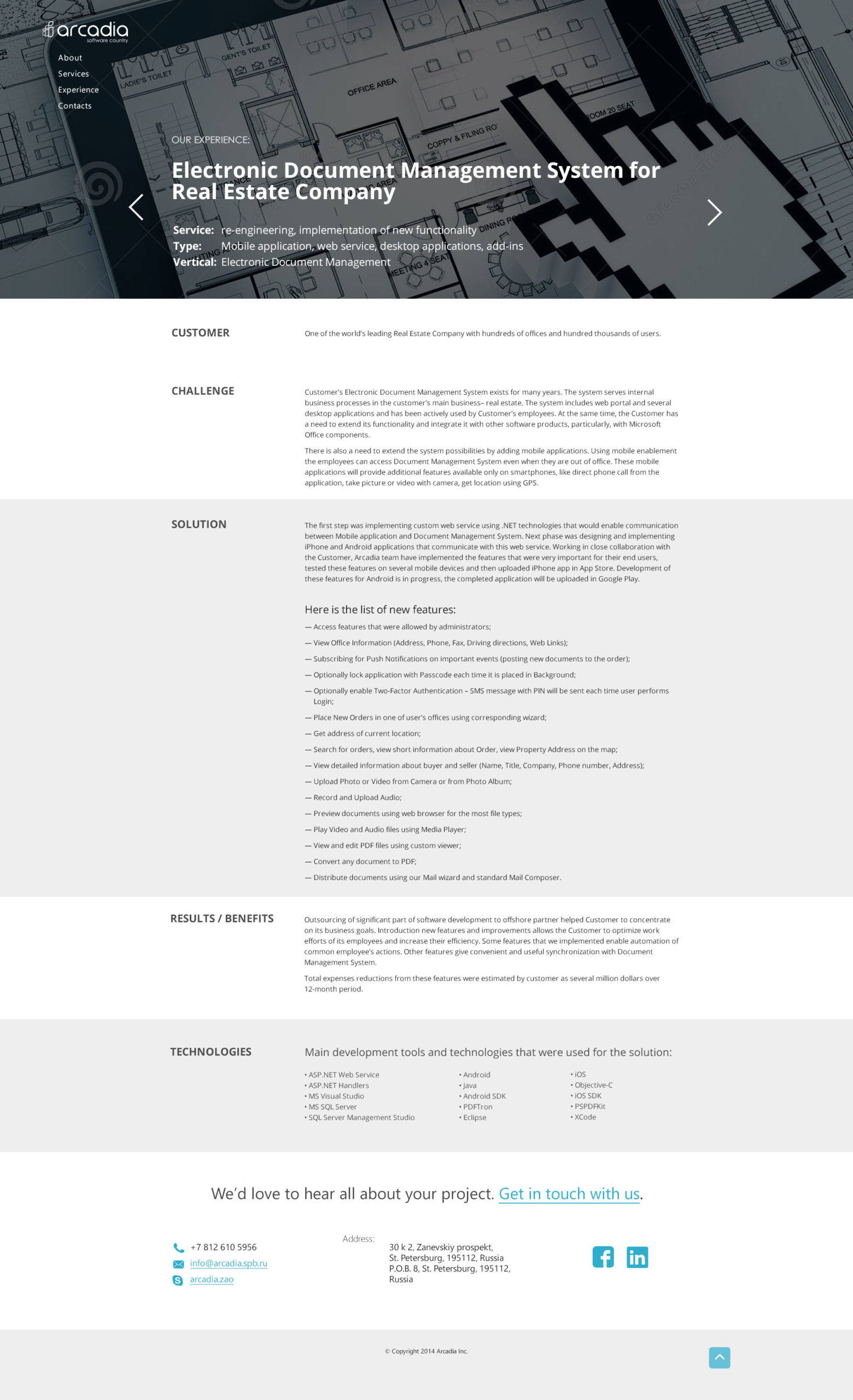
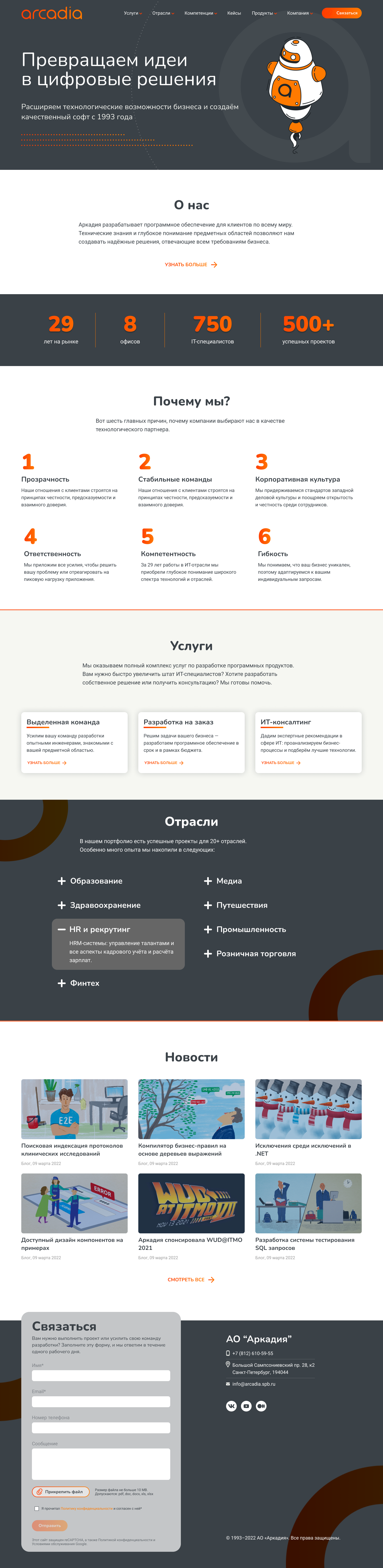
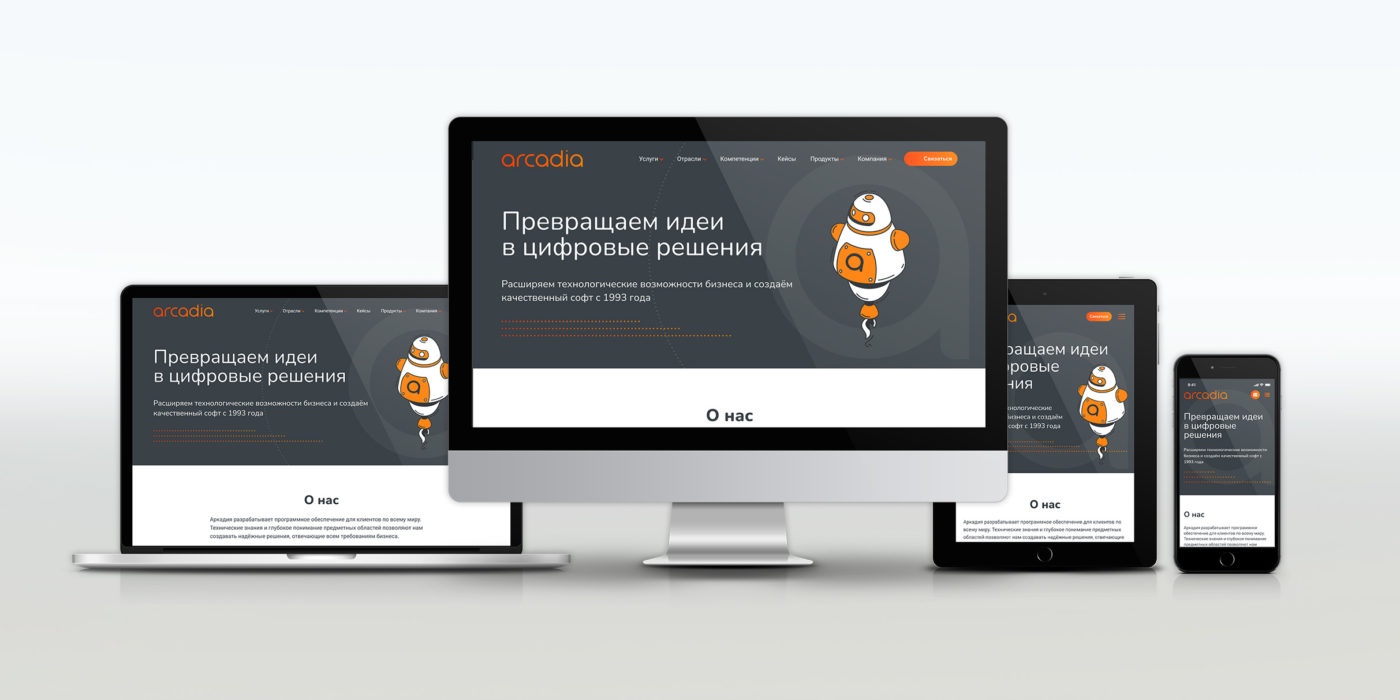
Arcadia is a software development company — full-cycle custom builds, dedicated teams, IT consulting, across a range of industries.
I’m the sole designer on the site, working in Figma from the structure and copy the marketing team provides, and handing off to the in-house developers who build it in Umbraco.
The problem
Everything Arcadia sells is technical and abstract: development capabilities, a deep technology stack, a spread of industries, a delivery process. All of it has to land with a prospective client fast — someone deciding whether this is a company worth trusting with a real project. A cluttered or dated site plants doubt; a clear one signals a company that has its act together. The brief asked for a more current, credible site. I read that as a legibility problem: make the depth easy to see.
Making it scannable
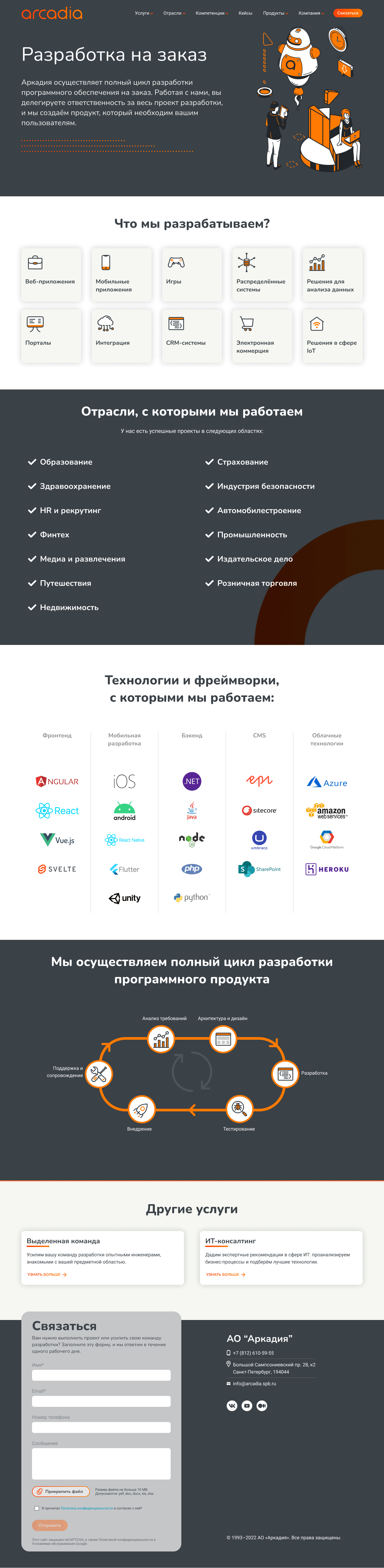
Marketing handed me the content mostly as bulleted lists — services, industries, technologies, process steps. Accurate, dense, and exactly the kind of thing a reader skims past. My part was deciding how each block should be shown.
A list of what the company builds became an icon grid you can scan in one pass. A long roster of technologies became a categorized stack — frontend, mobile, backend, CMS, cloud — that reads as range at a glance instead of a wall of logos. The development lifecycle became a single circular diagram. Every choice between grid, cards, diagram, or plain list came down to one question: what makes this block fastest to understand? None of it dresses up the content — it lets a technical buyer size up Arcadia without reading paragraphs.