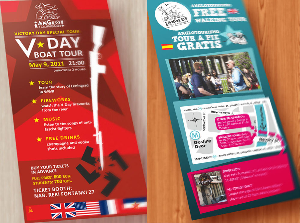
Anglotourismo ran boat and walking tours in St. Petersburg and held a TripAdvisor Certificate of Excellence for several years running. I designed their print materials: the main booklet, updated as new tours and features were added, plus standalone flyers for individual tours and seasonal events.
Anglotourismo’s audience was independent travelers, not package tour groups, so the booklet had to read as a local’s recommendation rather than a corporate brochure — bold, slightly loud color, marker-style hand-drawn highlight lines, a hand-drawn logo and cover illustrations, flags for language coding, and a hand-drawn-leaning typeface, laid over the client’s own casual, first-person copy. Most readers were also in the city for the first time, so the booklet needed to get someone to the right tour at the right time and place clearly enough to work as a standalone piece.
The booklet started as a standard three-fold Eurobooklet, but the content outgrew it and we moved to a five-fold construction to keep everything legible rather than shrinking it to fit. Color-coding separated boat tours from walking tours throughout, and in some years extended to individual boat routes on the map and schedule. The bigger structural test came when the boat tour switched to hop-on-hop-off: one departure pier became three, each needing its own way for a first-time visitor to find it. I gave each pier a code matching the map and schedule, a photo so it could be recognized on sight, the address as backup, and a QR code linking to Google Maps as a last resort. Every tour entry used the same scannable format: bold header, key details pulled out inline, then a fixed data block underneath.
The cover changed each year to keep the piece current.
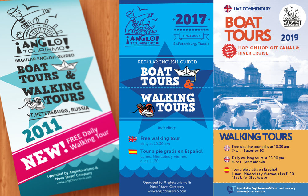
Booklet covers of different years.